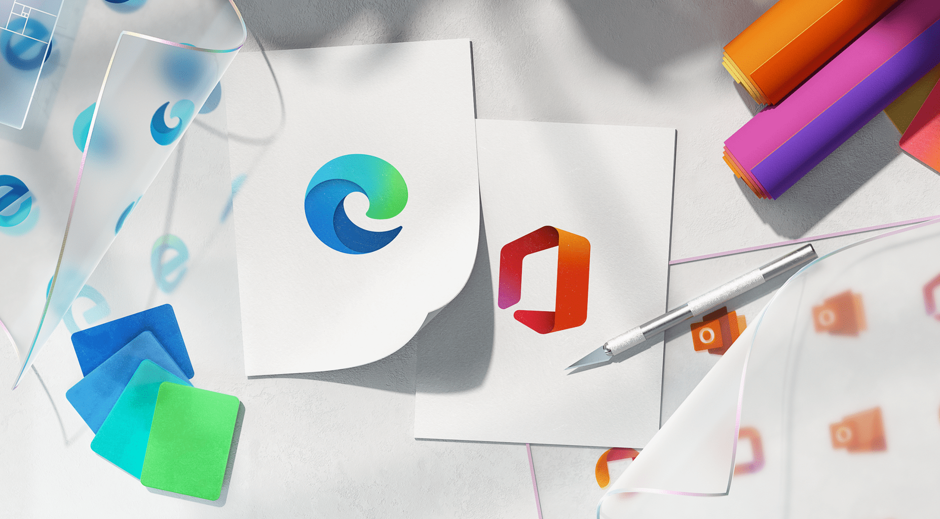
The community is long bored with same old designs they’re provided with. They either have to shift to a new OS or install new themes or launchers to have more attractive UI. But Microsoft is seen crafting new designs for its default icons, where users if updated, can see them. Verge says this act is to modernize their OS. Ans this is done first by tweaking its logo designs of Windows and app icons.
Redesigning almost everything!
Announcement of this new wave was made by John Friedman, Corporate VC of design and research at Microsoft. He said, Under Fluent Design program, the firm is redesigning hundred of their app icons to be more intuitive. This newly designed app icon can be seen from experienced by Fast Ring testers of Windows 10. First, built-in apps like Groove Music, Mail, Voice Recorder, Calculator, Calendar, Alarms & Clock, Movies & TV etc will get new icons, eventually followed all. If these changes have appeared on Fast Ring Windows 10, it’s more likely to hit general Windows 10 in just a couple of weeks. This new update could first be seen for Windows 10X, a variant of current Win10 crafted for dual-screen devices. Further, these new designs to be coming to mobile apps too, where Office apps are available.


